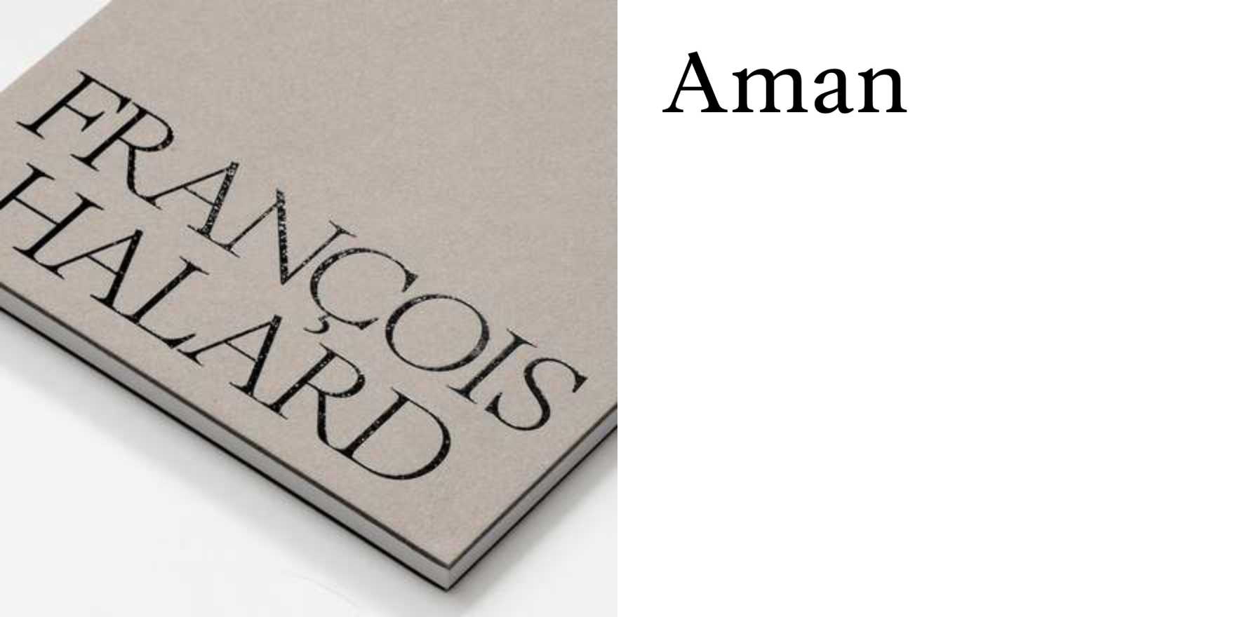
François Halard –
Why It's In The Canon
Halard's photographs are the best argument for studying type as ambient object rather than composed artifact. He shoots interiors — artists' studios, writers' apartments, inherited rooms — and in those spaces, letterforms appear the way they actually live: on book spines crowded into shelves, on painted signage aging into walls, in handwritten cards pinned beside a window. Nothing is styled for legibility. Type is texture, part of how a cultivated person composes their world. That's the lesson. Most designers learn type from specimen sheets and type-setting software. Halard shows it in context — worn, layered, working alongside color and material and light.
Study him specifically for the relationship between typographic scale and spatial depth. His images routinely hold a tight crop of a painted letter next to a long architectural vista, and neither fights the other. That compression is a model for screen layout — for how to let type breathe inside a dense interface without losing hierarchy. He's also an education in editorial restraint: his images appear in AD, Vogue Paris, and monographs for artists like Cy Twombly, and in each context the type that frames the work is invisible until you look for it. For anyone building web platforms or brand systems where the UI has to recede behind the content, that's the standard. He's in the canon because he documents type as it actually accumulates meaning — slowly, through use, through friction.


