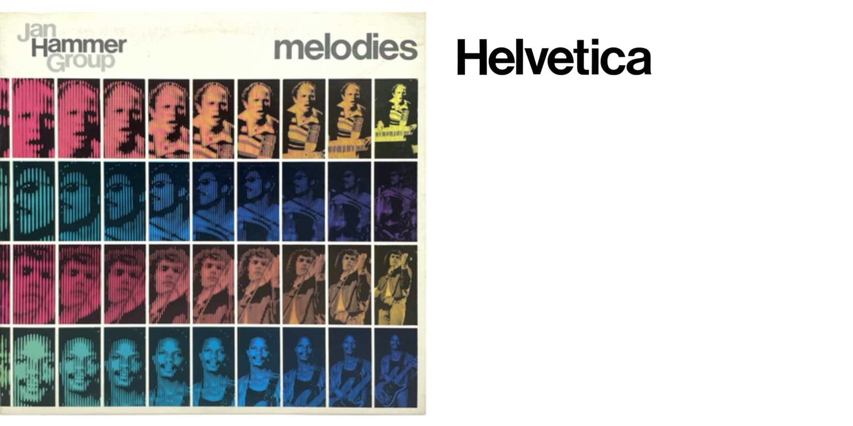
Jan Hammer Group –
Why It's In The Canon
The dash in the entry name is doing real work — it's the kind of compressed citation that assumes you already know which record. Jan Hammer Group's mid-70s sleeve design sits at a productive collision: jazz-fusion's appetite for futurism meeting the phototypesetting window, where type could finally be pushed, tracked loose, condensed past the point of editorial comfort, and treated as atmosphere rather than label. That's the instinct worth isolating. The type isn't naming the record — it's performing the same register as the music, slightly unresolved, technically adept, confident in a way that reads as style before it reads as information.
What transfers to current work is the underlying logic: type-as-event rather than type-as-container. Web and product design defaulted early toward legibility doctrine — type in service of content hierarchy — and most designers have never had reason to question it. Record sleeves from this era are one of the few commercial archives where the opposite assumption operated at scale, and Hammer's work is useful precisely because the name wasn't powerful enough to coast on. The design had to earn the surface. Study the weight contrast against bleed, the relationship between tracking and the negative field, the willingness to let letterspacing destabilize readability in service of mood. That's a live problem for anyone building brand systems or editorial interfaces where atmosphere has to land before the reader commits to reading.


