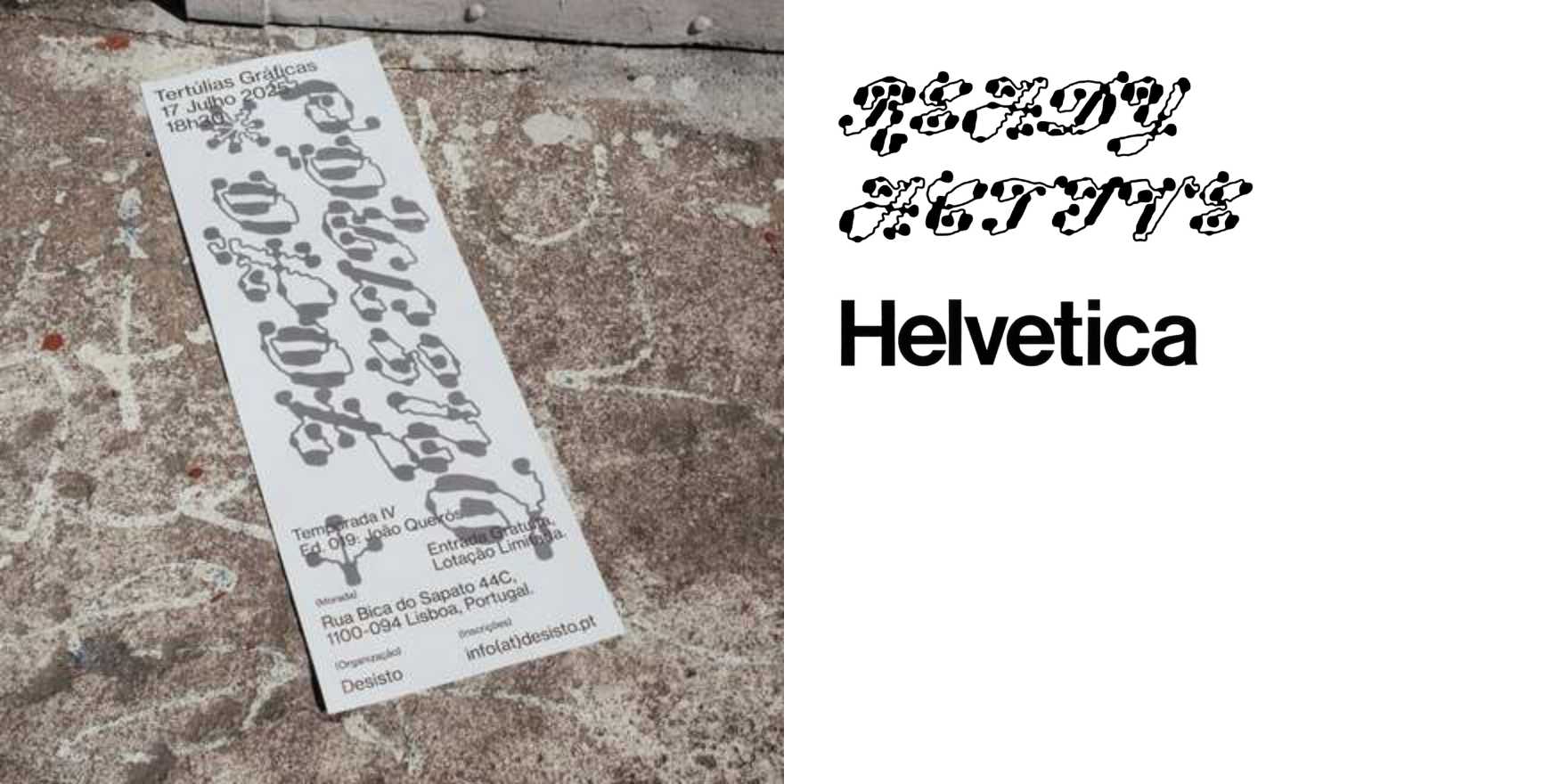
Tertúlias Gráficas, Edition 019: João Queirós
Why It's In The Canon
Tertúlias Gráficas runs a structural bet: put a type designer in conversation, then let the publication itself be the specimen. Edition 019 with João Queirós earns its place because Queirós is one of the cleaner examples of a designer who works historically without turning nostalgia into a product. His practice reaches into the letterform archives — Portuguese colonial-era printing, early twentieth-century commercial lettering — and extracts structural logic rather than surface texture. The distinction matters. Plenty of designers treat historical research as mood board; Queirós treats it as engineering.
What to study in this edition specifically: the way the editorial typography doesn't perform the interview's subject so much as respond to it. The magazine makes a choice about which Queirós it's presenting, then holds that choice consistently through hierarchy, spacing, and weight selection. For anyone building type-forward interfaces or selecting typefaces for brand systems, the lesson is in the restraint — how much interpretive work the layout is doing without announcing itself. The Portuguese design scene runs on different references than the American or German traditions that dominate most type education, and that difference is load-bearing. The Iberian type tradition carries its own logic about formality, legibility at small sizes, and the relationship between calligraphic history and digital production. Knowing Queirós means you have a fuller map of what the Latin script can actually do, and a harder time defaulting to the same forty typefaces everyone else reaches for.