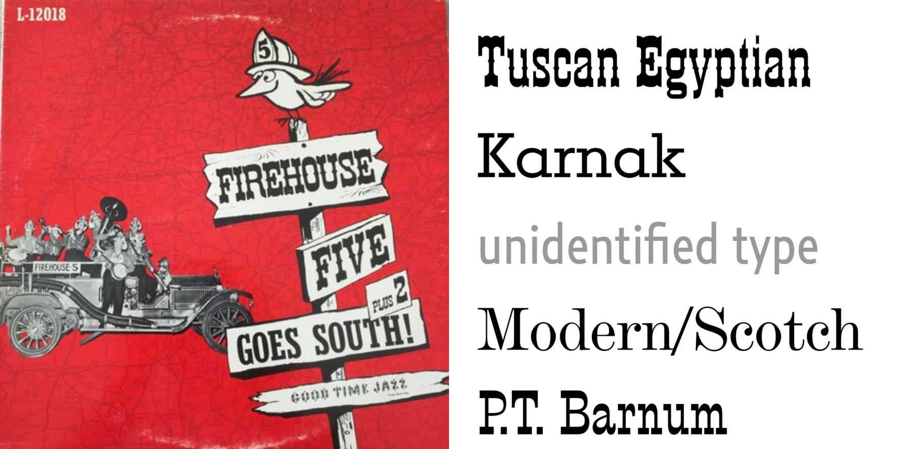
Firehouse Five Plus Two –
Why It's In The Canon
The Firehouse Five Plus Two covers work because nobody was trying to make them work. The typography on these late-40s/50s Dixieland records — woodblock-weight letterforms, hand-drawn titling, the kind of setting that treats a band name like a firehouse door sign — operates entirely outside the visual grammar of institutional design. That's precisely the point. The designers (studio generalists, not specialists) weren't optimizing for systems; they were solving a feeling: amateur musicians, New Orleans roots, joy-first. The type carries that unambiguously.
What to study: the variable weight within a single letterform, the way condensed faces get mixed with broad display without apology, the color decisions that feel wrong in principle and right in practice. This is pre-grid American vernacular at a specific moment of maturity — postwar print culture that knew its craft without knowing it was being archived. The looseness is real, not performed. For anyone building tools or brand systems that need to feel alive rather than resolved, this is the reference that explains why hyper-systematized type always reads as cold. The warmth isn't texture or distress filters — it's the evidence of a decision made by a person for a specific thing, not a rule applied to a category. That distinction is the entire argument against over-engineering visual identity, and it's sitting on a 1951 jazz record.


