Lucca Comics & Games 2024
Why It's In The Canon
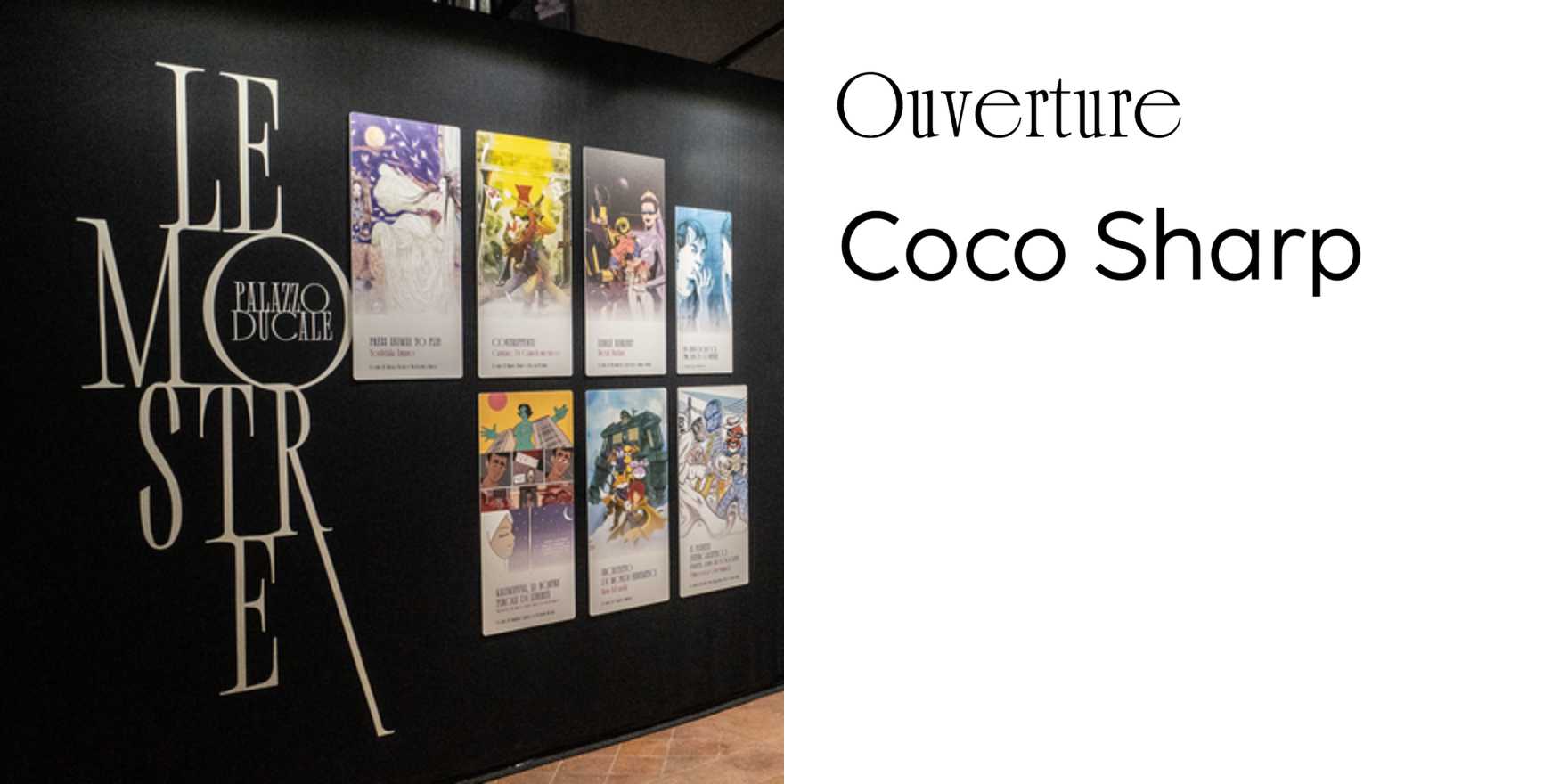
The Lucca Comics & Games 2024 identity earns its place here because it solves a genuinely hard brief: a unified visual system for a festival that occupies an entire medieval city. Type has to work on a banner the height of a palazzo and a wristband at the same time, at the same temperature. The 2024 system handles this through scale-invariant typographic logic — the letterforms aren't re-dressed for each application, they're structurally set up to hold at any size without losing character. Study the hierarchy decisions: condensed, high-contrast faces doing wayfinding through narrow stone streets face a readability constraint that would collapse most editorial type systems. What emerges is strict function dressed as exuberance — the right answer for an event running across a dozen thematic tracks simultaneously without dissolving into noise.
The Italian context matters. There's a specific lineage of festival graphic design — heavy, ink-rich, built for offset printing and poster scale — that Lucca sits inside while updating it for environmental and digital surfaces. The 2024 edition shows what happens when that tradition gets pushed toward systems thinking rather than one-off poster beauty. For anyone designing identity systems that need to span contexts — onboarding, marketing, conference presence, product UI — this is a clean case study in constraint-first reasoning: identify your hardest surface, anchor the type logic there, then pull every other application toward that center.


