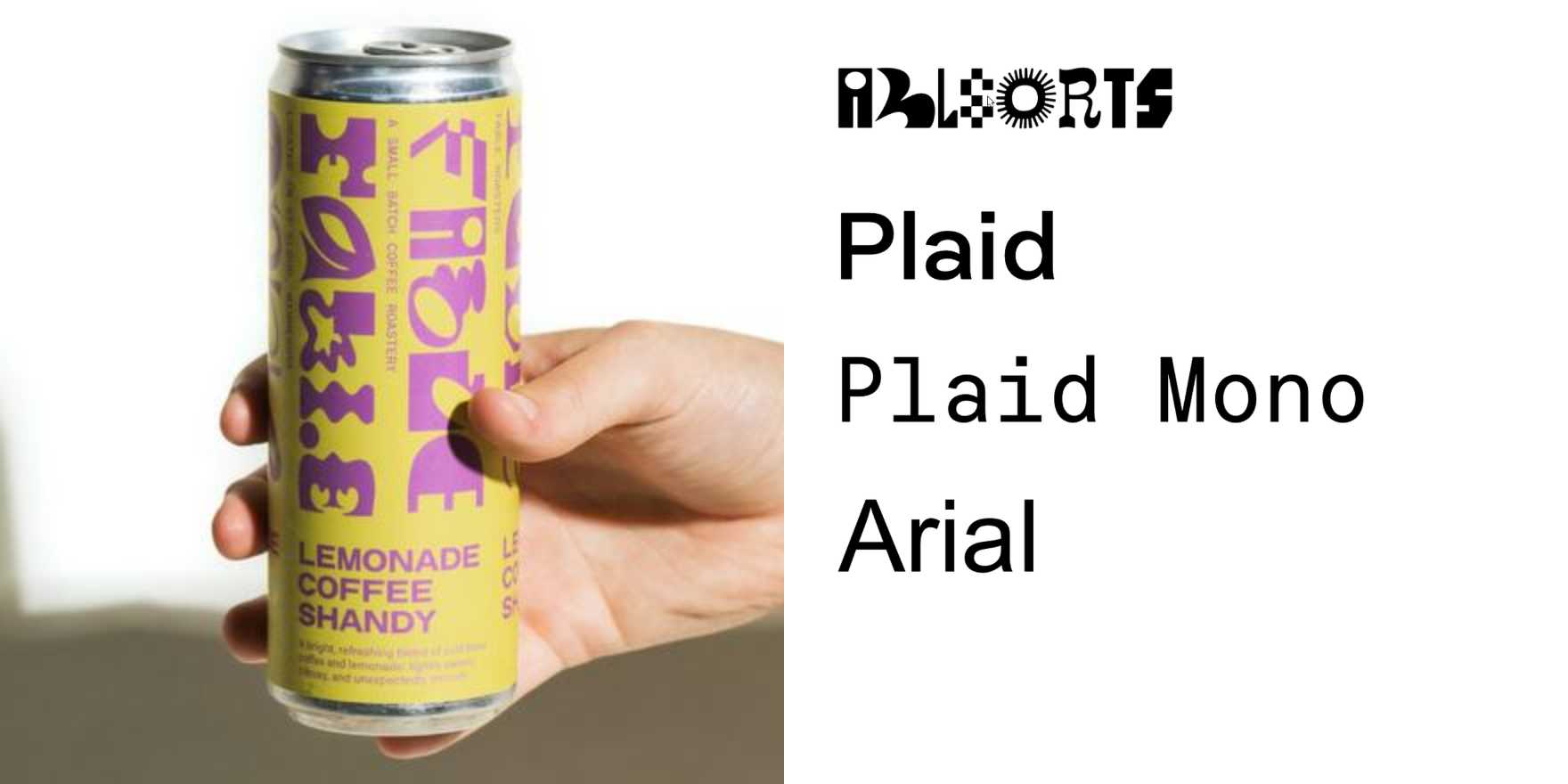
Lemonade Coffee Shandy by Kinder Coffee Lab
Why It's In The Canon
Specialty coffee packaging is one of the last commercial contexts where typographic risk-taking gets budget and cultural permission simultaneously. Kinder Coffee Lab's Lemonade Coffee Shandy earns its place here because the type doesn't illustrate the product — it is the product. The name alone is a register problem: "shandy" is beer-world casualness, "lemonade coffee" is functional novelty, and the whole thing has to read as summer-light and credible at once. Whatever typeface decision they made had to absorb all of that without a graphic crutch. Study how they handle weight contrast between the product name and the parent brand, and whether the type reads as warm or neutral — that gap is where the whole sensibility lives.
The broader lesson is about type operating under real constraint: small label real estate, non-flat surfaces, three reading distances (shelf, hand, table). You don't get to control the context. This is the opposite of screen typography, and that's why it belongs in the canon for someone building creative or brand tooling. The questions raised here — what makes a letterform feel seasonal without being decorative, how you hold authority and approachability in the same setting — translate directly into type system decisions for interfaces and brand guidelines. It's a small object doing heavy conceptual lifting. That's the ratio to study.


