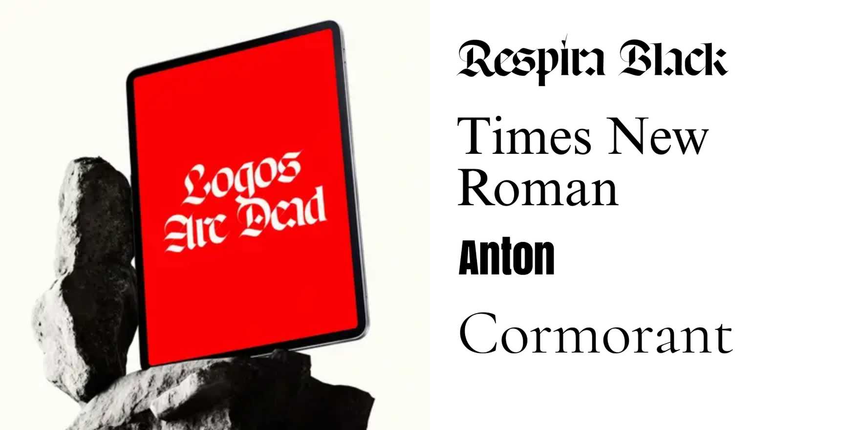
Logos are Dead
Why It's In The Canon
The standalone logomark is a liability. Small screens, dark mode, responsive breakpoints, favicon slots, notification badges, URL slugs, meta titles — none of these contexts reward a symbol. What survives is type. The shift from mark-first to type-first identity isn't aesthetic drift; it's structural pressure. A wordmark scales from 16px to billboard without the translation tax a symbol incurs. It carries language. It's searchable. It fits where brands actually live.
Study the evidence: the Google rebrand (2015) as the inflection point where the most recognized mark on earth quietly became typographic in every context that matters. Söhne as brand infrastructure across a generation of editorial and SaaS products — Klim and Frere-Jones selling type systems, not fonts. The Inter monoculture as unintentional proof: when everyone licenses the same neutral grotesque for the same interface, the logomark vanishes because no one reaches for it. The VC startup wave as accidental data: identical sans-serif wordmarks everywhere because the mark was never the point.
For anyone building creative tooling, a web platform, or a brand without a large production budget, this resets the priority stack. Type system first — one typeface that can carry weight, hierarchy, personality, and interface clarity simultaneously. Mark second, or never. The typographic voice is the identity. Everything else is optional decoration that will need to be resized anyway.


