COMPANY –
Why It's In The Canon
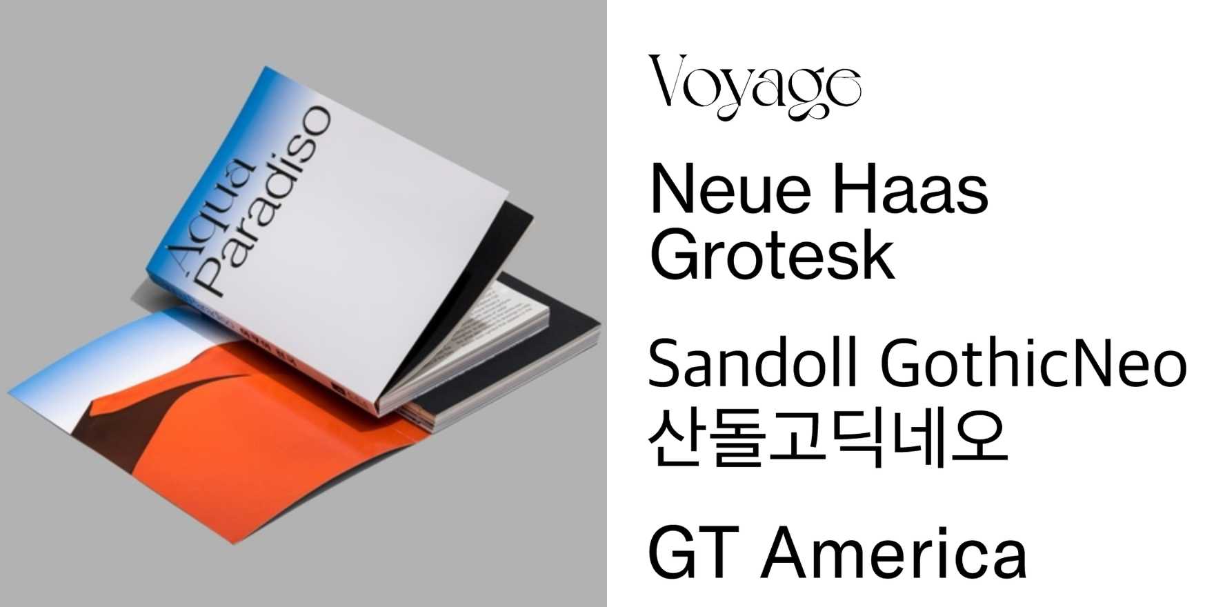
The lesson in studying how companies deploy type isn't in the typeface choices — it's in the decisions around scale, hierarchy, and when to let typography carry a brand versus when to suppress it entirely. "COMPANY –" makes that legible because its curation forces comparison: you're reading deployments across sectors, contexts, and constraints, which strips the noise of any single art director's taste and reveals structural patterns. You start to notice things that specimen pages cannot show — how a wordmark behaves at 12px versus 400px, why certain grotesques collapse at small sizes while others sharpen, how economic constraint produces different typographic decisions than brand ambition does.
For anyone building platforms, identity systems, or design tooling, this kind of archive trains pattern recognition faster than theory does. Once you've seen forty competent deployments of a typeface you thought you understood, the typeface stops being the variable. What to study here: the relationship between grid discipline and typographic confidence, how companies resolve the tension between a typeface's historical connotations and contemporary positioning, and where the most interesting choices appear — almost always in the subordinate text, the captions, the interface states, not the logo mark. The logo is the press release. The rest is the actual decision.


