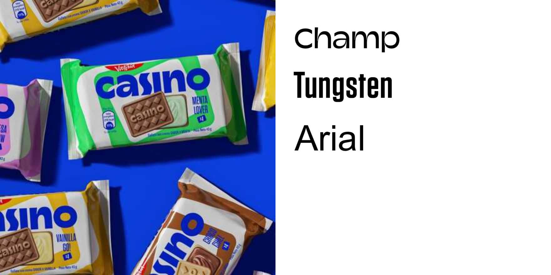
Leisure Projects
Why It's In The Canon
The calibration here is the thing to study — Leisure Projects occupies that narrow band where type selection feels neither safe nor willfully obscure, just precise. The choices read as typographically literate without performing it: letterforms that carry cultural weight before a word is read, hierarchies built from structural logic rather than stylistic habit. That's a harder trick than it looks, and it's rare enough to be worth reverse-engineering.
What earns it a place in the canon is that it demonstrates type-in-use as a design position, not an aesthetic preference. The weight contrast decisions, the scale relationships, the amount of page the type is allowed to own — all of it adds up to a legible point of view about what contemporary design communication should feel like. The influence shows up in a specific strand of editorial and digital work: confident negative space, nothing borrowed from the safe-fonts list, letterforms doing compositional work the layout doesn't need to explain. For anyone building creative tools, brand systems, or web platforms where typographic taste is actually a product decision (and it always is), this is the kind of reference that trains the eye before the brief arrives. You don't cite it; you start making better calls.


