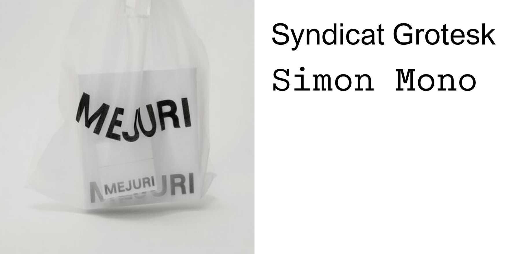
Mejuri
Why It's In The Canon
Mejuri built a brand identity almost entirely through type decisions, which is what makes it worth studying. The thin serif headlines, loose tracking, lowercase-forward hierarchy — these aren't decoration, they're doing the entire job of signaling price point, audience, and aspiration without any of the usual luxury-brand machinery (no crests, no history, no founder mythology). The typography performs restraint as a value proposition. That's a specific and replicable technique.
What's instructive for anyone working on brand or web platforms is the relationship between type weight and perceived cost. Mejuri's lightest weights in editorial contexts read as expensive. The same content set in a heavier cut or tighter tracking reads as fast fashion. They figured out — or stumbled into — a typographic grammar for "accessible fine goods" that the entire DTC jewelry category subsequently copied, which means you can now see the original clearly by looking at how diluted the imitations are. Study the spacing on the product pages specifically: the ratio of white space to text block is doing as much work as the typeface itself. For anyone designing e-commerce, editorial interfaces, or brand systems where the visual language needs to carry a premium signal without explicit price cues, this is the primary reference for how type alone closes that gap.


