Peter, Paul & Mary –
Why It's In The Canon
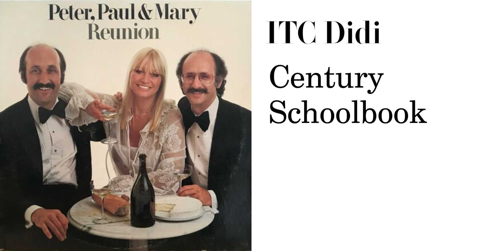
The folk revival visual work from this era solved a problem that's still live: how do you make a brand feel like it wasn't designed. Peter, Paul and Mary's album lettering and concert bills — particularly the early Warner Bros. era material — used humanist, Roman-adjacent type at a moment when American music industry defaults were corporate sans or novelty display. The choice created separation without noise. The letterforms felt hand-adjacent without being irregular. They implied people, not product.
Worth studying specifically: how the name resolves as a typographic unit. Three proper nouns, a conjunction, an ampersand — it's a live test case for how proper names become logotypes without intending to. The & is where most designers overreach. Here it sits. The spacing holds. Nothing is compensating for anything. The warmth is structural, not decorative — it comes from the letterform decisions, not from softness added afterward. That's the distinction that matters. Restraint as the mechanism for approachability is the recurring problem in branding for independent creators, cultural platforms, and any product trying to feel human at scale without sliding into performed humility. Study what they didn't do as much as what they did.


