Ludwig Kuffer, Jan van Hal, Tobias Becker –
Why It's In The Canon
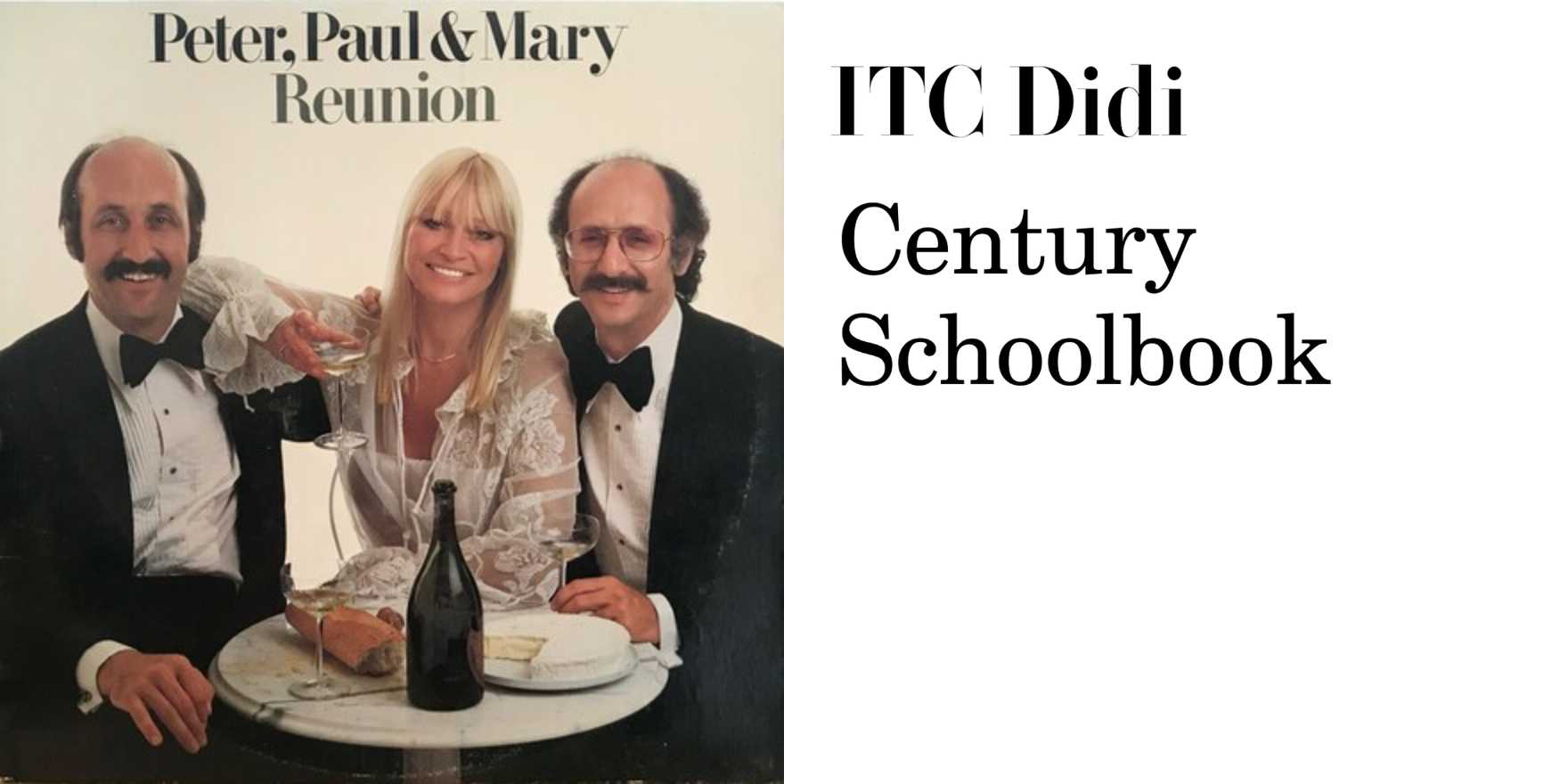
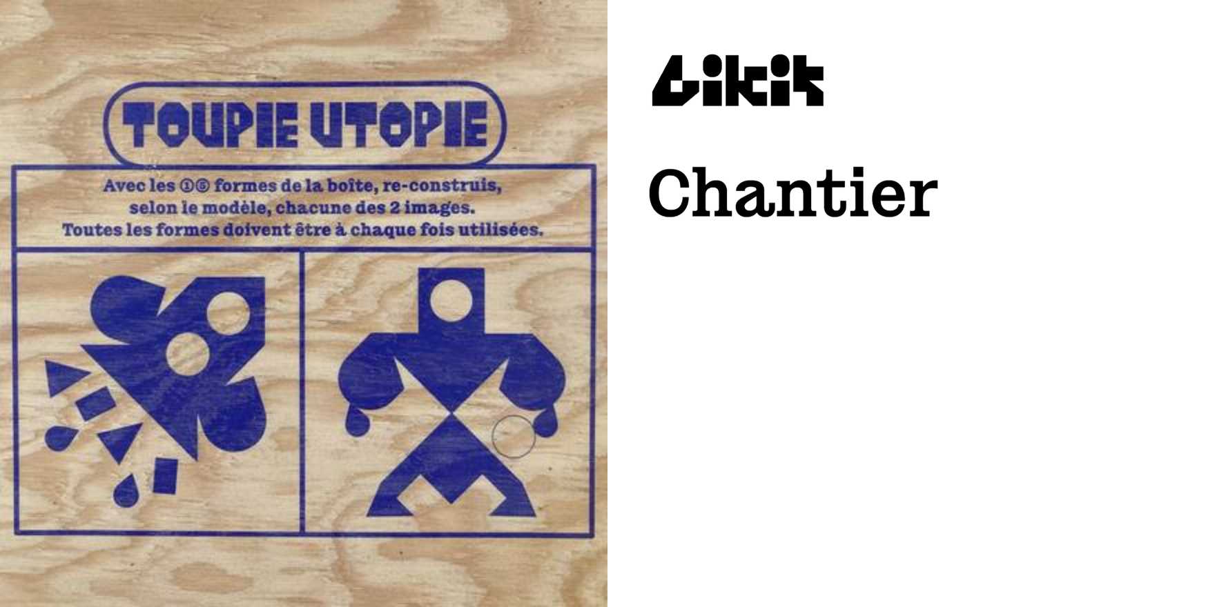
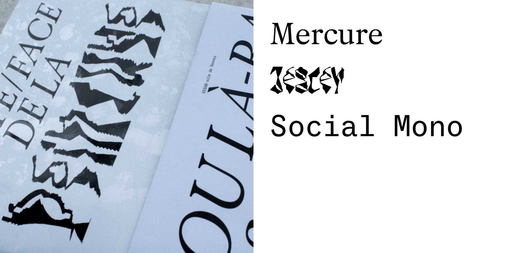
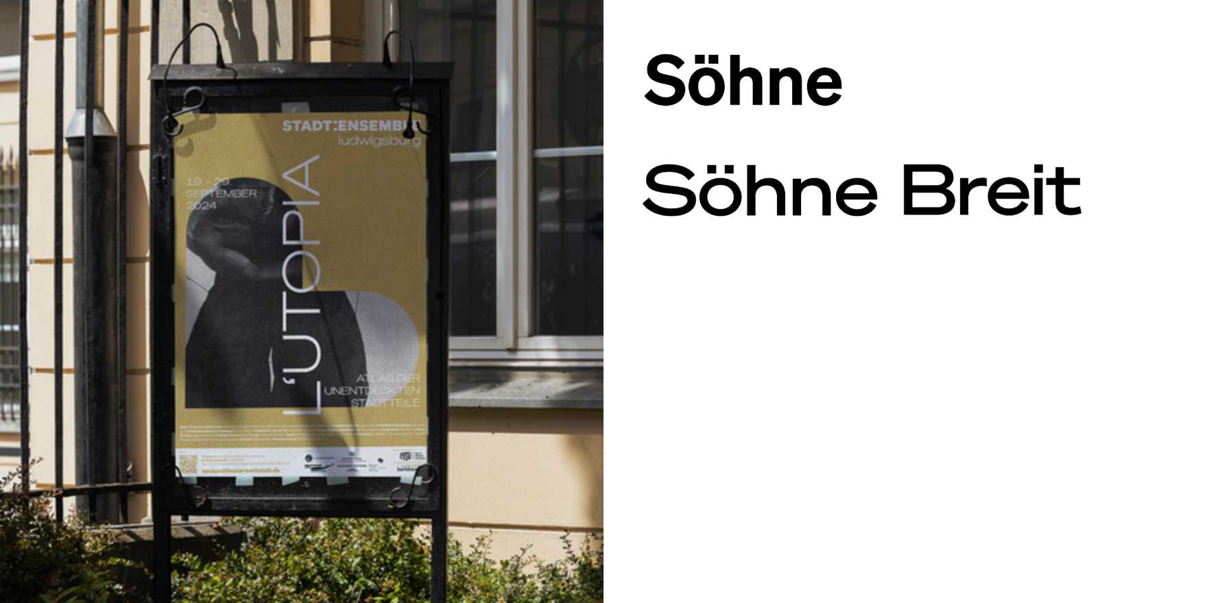
German contemporary type culture runs deep enough that the gap between drawing letters and deploying them is nearly philosophical — and this trio operates squarely in that gap. What makes them worth studying together isn't a shared house style but a shared discipline: typographic decisions made at the level of the page, the screen, the editorial system, not just the glyph. The "type in use" framing is the key. This isn't specimen work. It's evidence of how sophisticated type judgment functions in actual production contexts — where spacing decisions compound across a full spread, where weight selection carries editorial tone, where the choice between a display cut and a text cut isn't aesthetic but structural.
For anyone building creative tools, brand systems, or editorial web platforms, the German tradition they're drawing from matters: the inheritance runs through Tschichold's functional rigor, through Aicher's systematic thinking at Ulm, through Spiekermann's insistence that type is language before it is art. What Kuffer, van Hal, and Becker bring is a contemporary inflection of that — work that doesn't treat rigor as a constraint but as a method for generating range. Study the kerning logic, the editorial hierarchies, the decisions that don't announce themselves. That's where the fluency is.