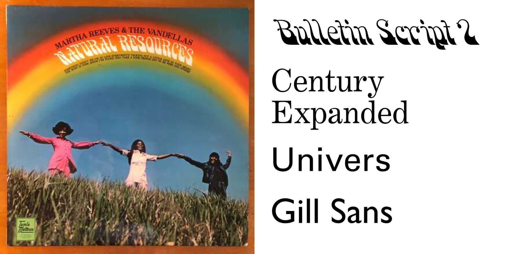
Martha Reeves and the Vandellas –
Why It's In The Canon
Motown's visual identity was engineered as deliberately as its sound, and studying Vandellas-era packaging reveals exactly how a label used type to signal aspiration before "brand strategy" had a name. The Gordy sublabel's 45s are a masterclass in mid-century commercial hierarchy: bold condensed caps for the artist, a distinct weight shift for the song title, the label logo holding its own against everything competing for attention in a three-inch circle. What's worth isolating is the tension — between the sophisticated presentation Berry Gordy demanded and the workhorse commercial printing that actually produced it. The output isn't polished in a contemporary sense. It's deliberate under constraint, which teaches something no clean-room design system will.
For anyone working on branding or web platforms, this is where you trace the lineage of the "warm authority" typographic register that keeps cycling back through contemporary design — the condensed grotesque paired with humanist detail, the tight tracking on display copy that reads as confidence rather than compression. The Motown aesthetic has been sampled so many times in visual culture that you need to know the original to read the derivative clearly. These record sleeves are where you find it unadulterated: type doing status work in a context where every decision was constrained by budget, timeline, and the size of a paper label. Study the hierarchy, not the nostalgia.