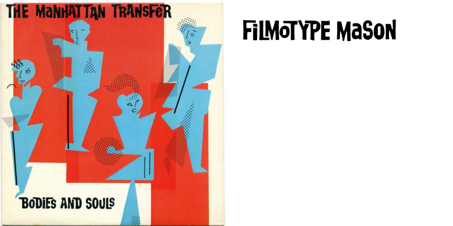
The Manhattan Transfer –
Why It's In The Canon
Dos Passos structured Manhattan Transfer the way cities actually feel — discontinuous, overlapping, rhythmically brutal. The chapter openings function as typographic events: short, percussive, almost signage-like. They're not decorations on prose; they carry mood the way a typeface carries tone before a word is read. That compression — text as environment, not just content — is the thing to study. It predates grid theory by decades but anticipates exactly what grid theory would eventually try to formalize.
For anyone building interfaces or designed surfaces today, the lesson is in pacing and register. Dos Passos switches voice mid-page without transition markers, trusting the reader to track context through cadence alone. This is how good UI copy works, how brand systems handle scale across touchpoints — not by labeling everything, but by training the reader's eye to recognize shifts in weight and rhythm. The book also sits at the origin of montage as editorial structure, which runs directly through mid-century magazine design into contemporary editorial web work. Study it for the same reason you'd study Brodovitch: not to imitate the era, but to see how much load a well-timed break can carry when everything else has been stripped away.


