mowe, Festival for Art and Urban Culture, Berlin
Why It's In The Canon
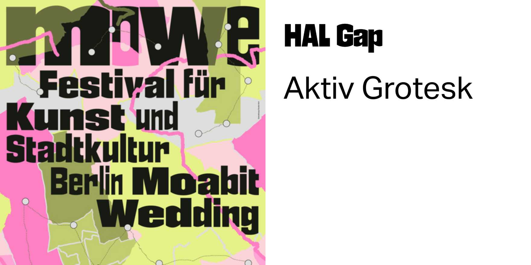
The name barely registers as a word — it functions as a mark, which is the point. Mowe's festival identity belongs to a lineage of German graphic culture that refuses the division between editorial and environmental design: the same typographic logic holds from a program booklet to a 10-meter banner to a tote bag. That structural consistency is what makes it worth pulling apart. The letterforms carry the tension specific to Berlin's design scene — somewhere between the geometric rigor of mid-century Swiss influence and the abrasive, low-budget urgency of underground print culture. It doesn't resolve that tension, it stays in it, and that ambivalence is legible.
For anyone working on cultural platform branding or event-adjacent products, this is a case study in how type alone can carry institutional identity without logomark dependency. No icon. No wordmark in the conventional sense. The typographic system is the brand, which means every application either reinforces or corrodes it — no neutral moves. Study how the weight and spacing decisions create rhythm at multiple scales, and how the name itself (short, Germanic, consonant-heavy) becomes a formal object rather than a signifier. That transformation — from language to shape — is the problem contemporary creative tooling keeps trying to solve with AI-generated logos. This is what solving it by hand looks like.