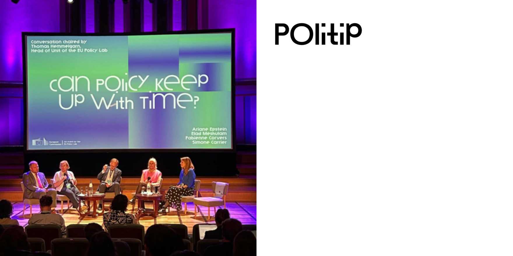
PolyFutures
Why It's In The Canon
The instinct here is to collect typefaces. The actual lesson is about editorial temperature — how the same letterform reads as speculative or archival depending entirely on what surrounds it. PolyFutures operates in that gap: typography deployed to signal not just aesthetics but a stance on what comes next, which is a harder thing to fake than most designers realize. The work is useful precisely because futures-coded type tends toward either sterile tech-minimalism or retro-futurist pastiche, and this material navigates that corridor without collapsing into either.
Study it for the setting decisions before the typeface selection. The question it keeps forcing is: what makes type feel forward-facing without feeling cold, and what makes it feel warm without feeling nostalgic? Those are live questions for anyone building interfaces or brand systems right now, where the default modes are either Geist-and-Inter cleanliness or heritage serif revival. Neither is adequate for work that needs to feel present-tense. PolyFutures sits in the uncomfortable middle where editorial confidence does the load-bearing work, and tracking it shows you specifically where that confidence is exercised — scale relationships, mixed-weight logic, how hierarchy gets established without falling back on size alone.


