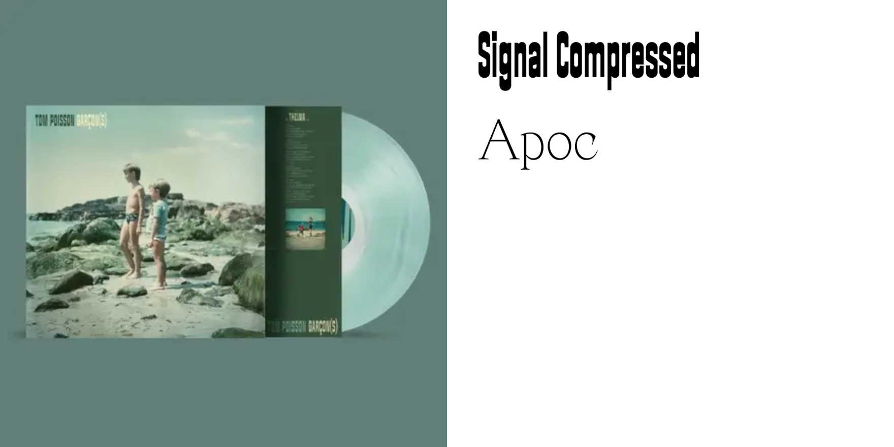
Tom Poisson –
Why It's In The Canon
French type design at this register operates differently than the Anglo-American tradition — tighter coupling between the drawn letterform and the editorial context it was made for. Tom Poisson's work earns attention because it shows what happens when a type designer stays close to the page: the spacing decisions, the weight contrasts, the way the italic sits against the roman. These aren't variables dialed in after the fact; they're built into the brief. Study the text settings specifically — where the type is small, where rhythm either holds or breaks. That's where the decisions become visible.
For anyone building platforms where typography has to work at scale — content tools, branding systems, anything where type is deployed by people who didn't choose it — this is a useful reference for what "opinionated but workable" looks like. French editorial typography tends to be less neutral than German, less performative than Dutch. It has personality without announcing it. That's a harder target to hit than it looks, and seeing a practitioner land it consistently is worth more than reading about grid systems. The value here is calibration: what does confident, quiet type design look like when it's working? This is one answer.


