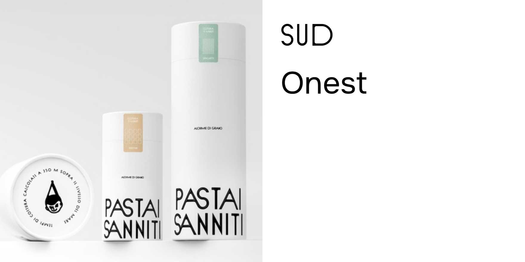
Pastai Sanniti
Why It's In The Canon
Regional Italian food producers do something the big brands can't fake: they use type that looks old because it is. Pastai Sanniti's labels are a study in how historical letterforms carry geographic and cultural weight without trying to. The Sannio region — inland south-central Italy, no tourist economy to perform authenticity for — produces pasta that's been labeled roughly the same way for generations. The typography isn't styled to look artisanal. It precedes the artisanal trend by decades.
What to study: how condensed serif display faces work at small label scale, how a tight palette (typically cream, deep burgundy, black) disciplines hierarchy without a grid, and how the type signals "this product has a specific origin" rather than "this product was designed to seem like it does." That distinction is the whole game in branding. Contemporary food and craft packaging is full of brands trying to simulate this exact register — usually through custom lettering that's too clean, too deliberate, too aware of itself. The Pastai Sanniti label works because the intention is absent. The type exists to communicate, not to perform. For anyone building brand systems or working on packaging, identity, or any context where "authentic" is the brief, this is the clearest illustration of what the real thing looks like — and therefore what every imitation is falling short of.


