Pastasciutta Antifascista
Why It's In The Canon
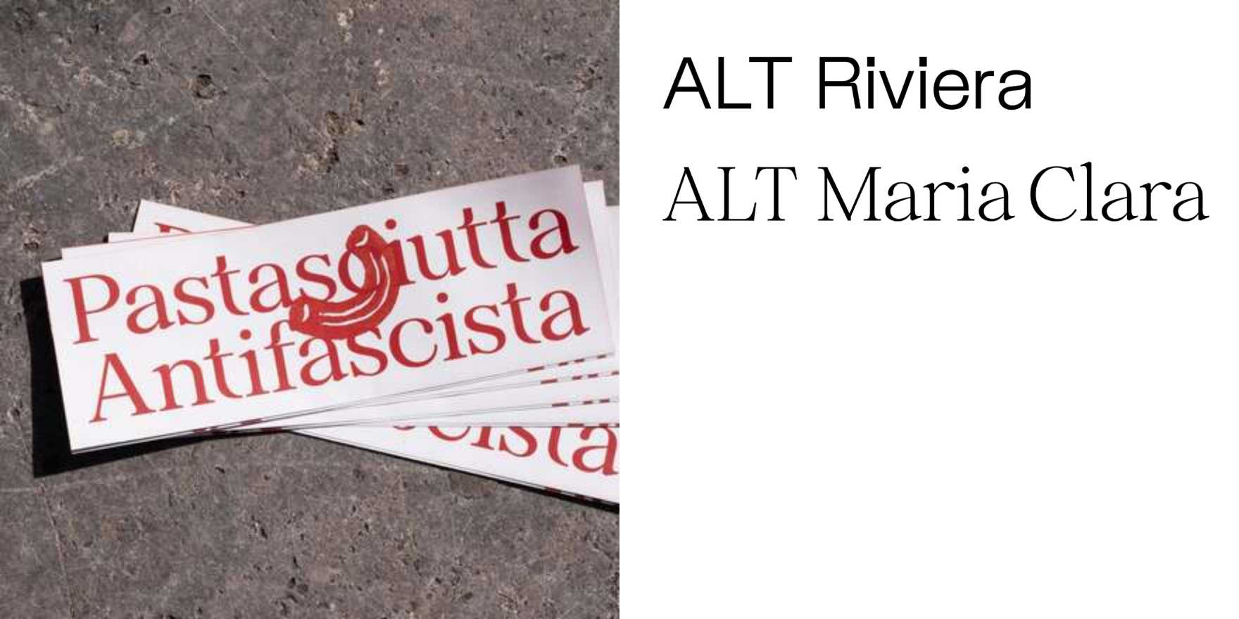
The posters that travel with Pastasciutta Antifascista events carry a graphic lineage from partisan print shops operating under occupation to contemporary Italian political design. The type is never decorative. Bold condensed grotesques, red-black-white, woodtype proportions — these aren't aesthetic choices, they're legibility under pressure, decisions made when your printer is clandestine and your reader is moving fast. Constraint producing conviction: the visual vocabulary feels urgent because it was forged in urgency.
What matters for anyone building platforms or brand systems is that this is a clean example of type as ideological signal before it's anything else. The Cervi family cooked pasta in a public square on July 25, 1943, the day Mussolini fell — the events held annually in their name have kept that graphic language alive and tested it against contemporary eyes. It holds. That durability isn't nostalgia; it's evidence that type choices rooted in actual stakes age differently than type chosen for trend. Study it for the hierarchy decisions, the weight contrast, the way lettering earns authority without polish. When you're deciding what a brand or interface communicates through its letterforms — before the mood board, before the font pairing — this is the kind of case study that clarifies what you're actually doing.