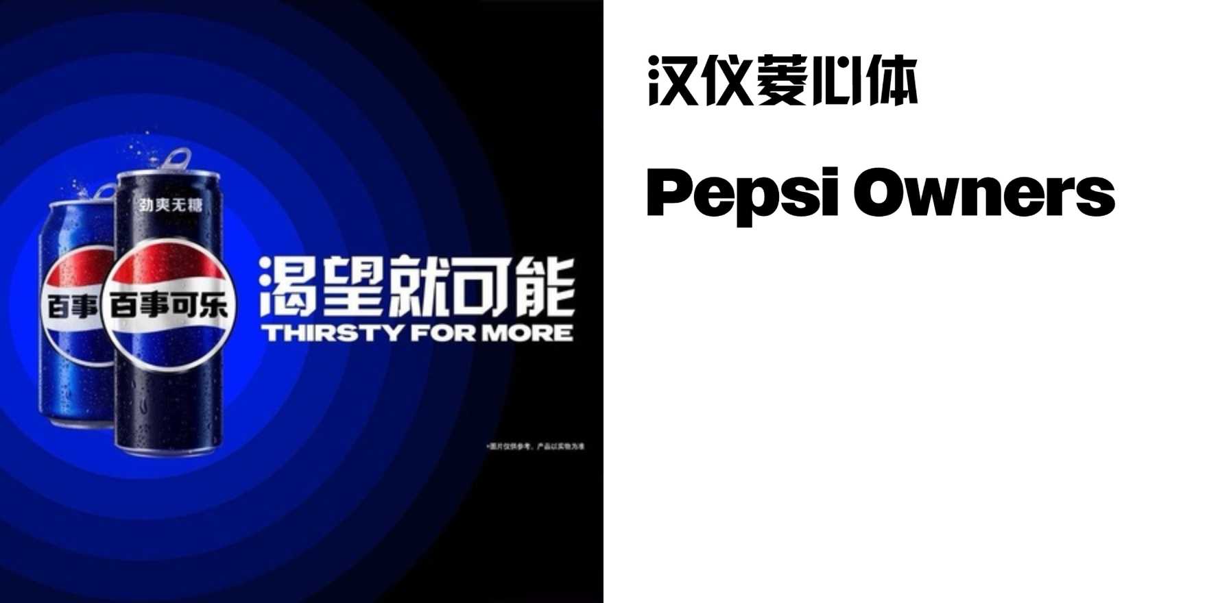
Pepsi Chinese market campaign
Why It's In The Canon
Pepsi's Chinese market work is one of the cleaner case studies in bilingual typographic coexistence — specifically the problem of running a brand that was built around a Latin wordmark through a logographic system where every character carries visual weight equivalent to an entire word. The solution wasn't transliteration; it was parallel identity. 百事 (Bǎishì) isn't a phonetic approximation, it's a meaning-carrying alternative — "hundred matters" — and the campaigns that integrated both scripts had to solve the scale and weight relationship between two type systems with fundamentally different stroke architectures. CJK characters optically dense at the same cap-height as Latin; Latin letterforms optically lighter at equivalent point sizes. Getting these to sit together without one system dominating is a problem every multinational brand faces, and Pepsi's Chinese executions — particularly the campaign materials that pushed both marks to similar optical weight — show how that tension gets resolved through sizing and negative space rather than stylistic matching.
Worth studying now because bilingual type is the default condition for any product with ambitions in East Asian markets, and most Western-trained designers have never been forced to think about it. The underlying skill — matching optical weight across scripts that don't share a common proportional logic — transfers directly to UI, branding, and packaging work anywhere a Latin brand needs to live inside a non-Latin visual system.


