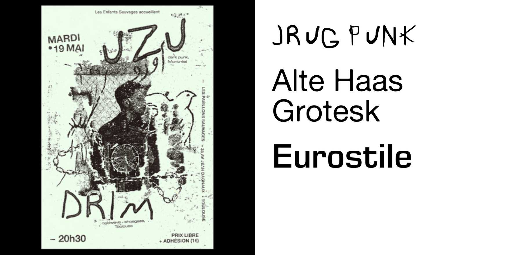
Uzu and Drim concert flyer
Why It's In The Canon
Uzu and Drim's flyer is a masterclass in restraint under maximal constraint: a concert poster that has to work as a wall object, a social share, and a ticketing thumbnail simultaneously, and solves all three with type alone. No hero image, no illustration crutch — just a typeface pushed to its structural limits doing the job photography usually does. That's the literacy point: most designers reach for imagery when they run out of ideas. This flyer proves type can carry emotional weight, genre signaling, and event hierarchy (headliner, date, venue, ticket link) without a single photo.
Study the scale jumps — how the type goes from whisper-small to poster-filling within one composition, and how that scale shift alone creates rhythm, almost mimicking the music itself. Look at how letterforms get treated as texture at large sizes: kerning gets weird on purpose, strokes start to read as pattern before they read as words. That's a direct line back to Swiss/Dutch experimental type posters (Wim Crouwel, Experimental Jetset) filtered through a contemporary, faster, more disposable event-flyer context.
For anyone building design systems or branding today, this is the reference for what a type-only identity can do when the budget is zero and the deadline is a week. It's proof that typography, handled with real confidence, doesn't need to borrow authority from a photo.