
Publication
2026Discover the unconventional design details hidden between the pages of Neat Rodanant’s publications
The composition is a series of stacked, vertically oriented panels, suggesting a modular or sequential publication format. The use of strong, contrasting colors (red and black) and bold, geometric typography creates a highly structured and impactful visual rhythm.
The design utilizes flat planes of color and stark graphic elements, characteristic of early 20th-century graphic design. The typography is sans-serif and highly stylized, emphasizing structure and function.
Closest kin

Publication
The Click’s clever university branding puts the ‘I’ in identity, individual and Imperial College London
![Independent Project Press [200007]](/api/local-img?p=canon%2Fcooper-hewitt%2Findependent-project-press-cooperhewitt-200007.jpg)
Print
Independent Project Press [200007]
Typeface
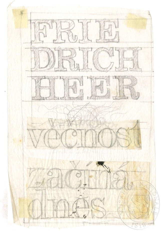
Typography - Eternity begins today
!["Gilbert Paper Exquisite [201674]](/api/local-img?p=canon%2Fcooper-hewitt%2Fgilbert-paper-exquisite-cooperhewitt-201674.jpg)
Print
"Gilbert Paper Exquisite [201674]

Drawing
The marriage of Heaven and Hell
Studio
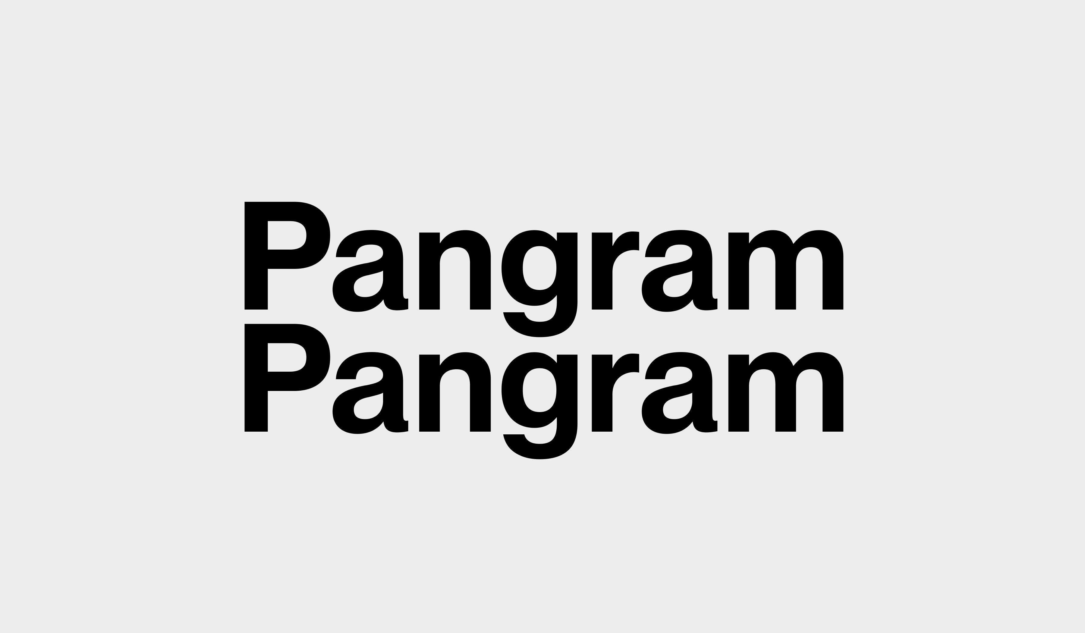
Pangram Pangram
Identity
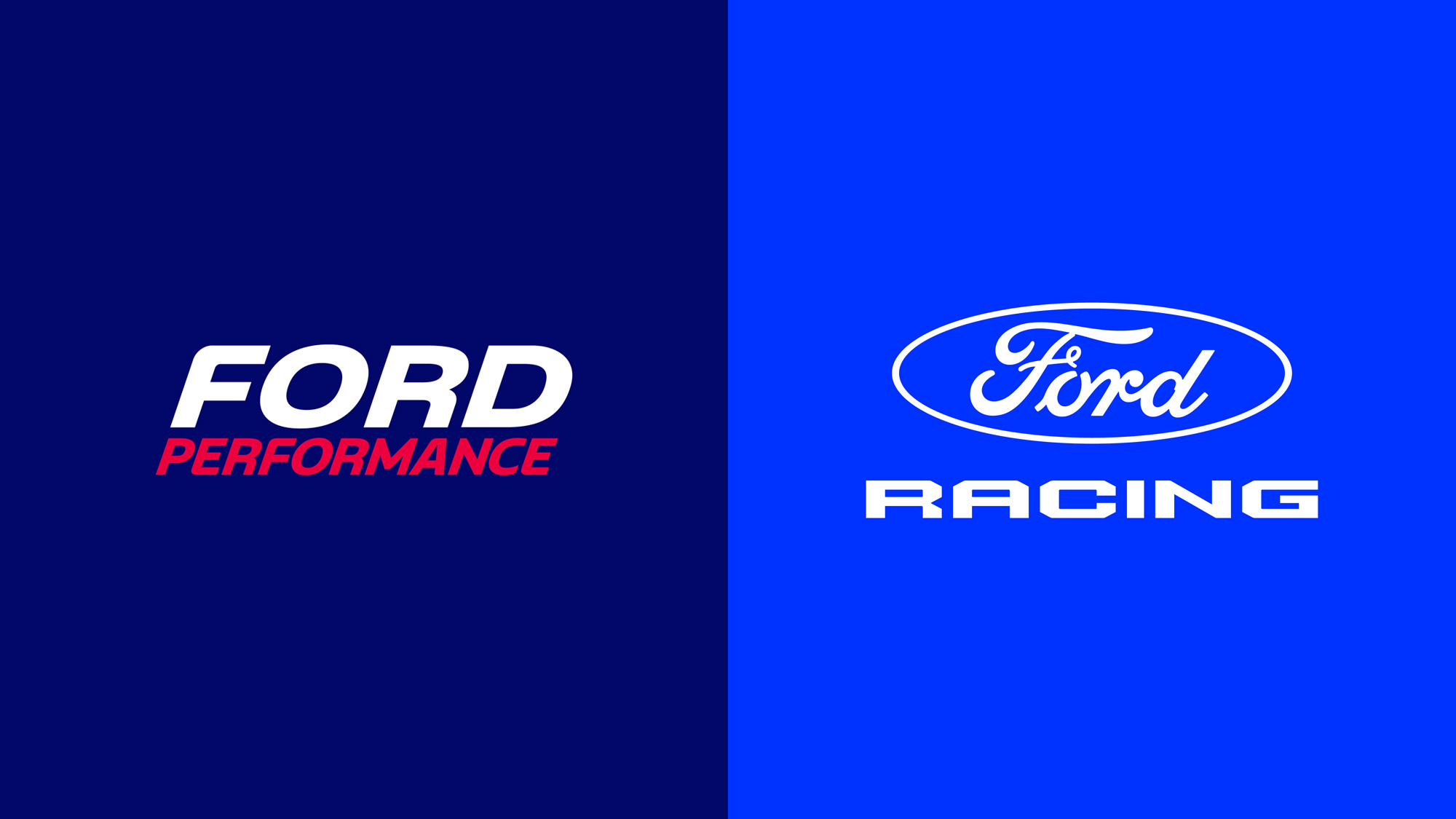
The Ford Awakens

Painting
Polish-soviet propaganda poster 14Y