Typography - Eternity begins today
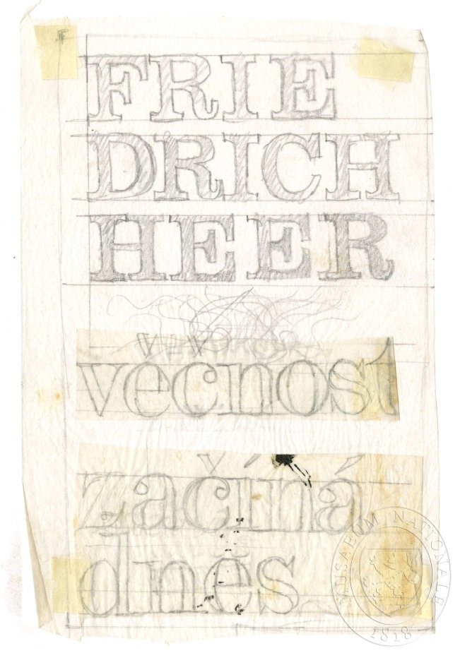
The composition is a vertical stack of text, demonstrating various typographic treatments. The text is arranged in descending size and complexity, starting with large, blocky, capitalized letters (FRIEDRICH HEER) and progressing to smaller, more delicate, and scribbled forms (VECNOST ZÁČNÁ DNES). The overall layout suggests a study or a sequence of ideas rather than a single cohesive visual message.
The piece appears to be a preliminary sketch or study executed in pencil and ink on aged paper. The lettering style is highly illustrative, featuring varying weights and decorative flourishes, characteristic of early 20th-century graphic design drafts. The use of multiple, distinct typefaces and hand-drawn elements emphasizes the typographic process itself.
Closest kin

![Independent Project Press [200007]](/api/local-img?p=canon%2Fcooper-hewitt%2Findependent-project-press-cooperhewitt-200007.jpg)
!["Gilbert Paper Exquisite [201674]](/api/local-img?p=canon%2Fcooper-hewitt%2Fgilbert-paper-exquisite-cooperhewitt-201674.jpg)