Print
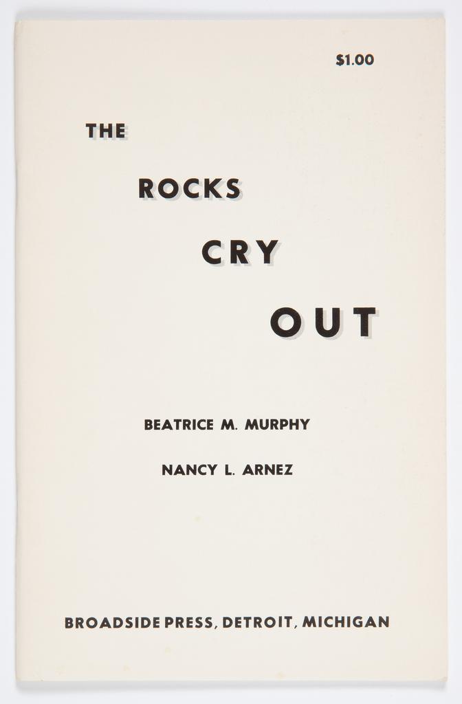
1969The Rocks Cry Out
The composition is highly centered and vertically aligned, utilizing negative space extensively. The text is stacked in distinct blocks, creating a rhythmic, almost monumental feel. The hierarchy is established through capitalization and spacing, giving equal weight to the title, authors, and publisher information.
The design relies solely on typography and layout. The use of a simple, sans-serif typeface (likely a grotesque or similar geometric style) contributes to the clean, unadorned aesthetic typical of early 20th-century commercial and literary ephemera.
Closest kin
![Independent Project Press [200023]](/api/thumb/400/bTpjYW5vbi9jb29wZXItaGV3aXR0L2luZGVwZW5kZW50LXByb2plY3QtcHJlc3MtY29vcGVyaGV3aXR0LTIwMDAyMy5qcGc.webp)
Print
Independent Project Press [200023]

Print
Cities Burning

Print
Typography Printing - Colour Woodcut Recipe — #PredmetAutor:10328973

Print
Teaching Fellowship in Graphic Design at Yale University

Print
Graphic Design China 2005 (GDC 05)

Identity
Sun’s Out Bond’s Out

Map
Title Page: Columbian World's Fair Atlas

Identity
Where there’s a Will there’s a Whey