
Map
1893Title Page: Columbian World's Fair Atlas
The composition is highly symmetrical and text-heavy, typical of late 19th-century publishing. The title is centered and uses large, bold, serif typography to establish authority and grandeur. The layout is structured with distinct sections for the main title, contents description, and publisher information.
The piece is a printed title page, likely using letterpress printing techniques. The typography is ornate and formal, characteristic of the period's printing standards.
Closest kin

Map
Table of Contents: Hammond's New World Atlas.

Map
Covers/Text: Etymologial Map World Atlas of True Names
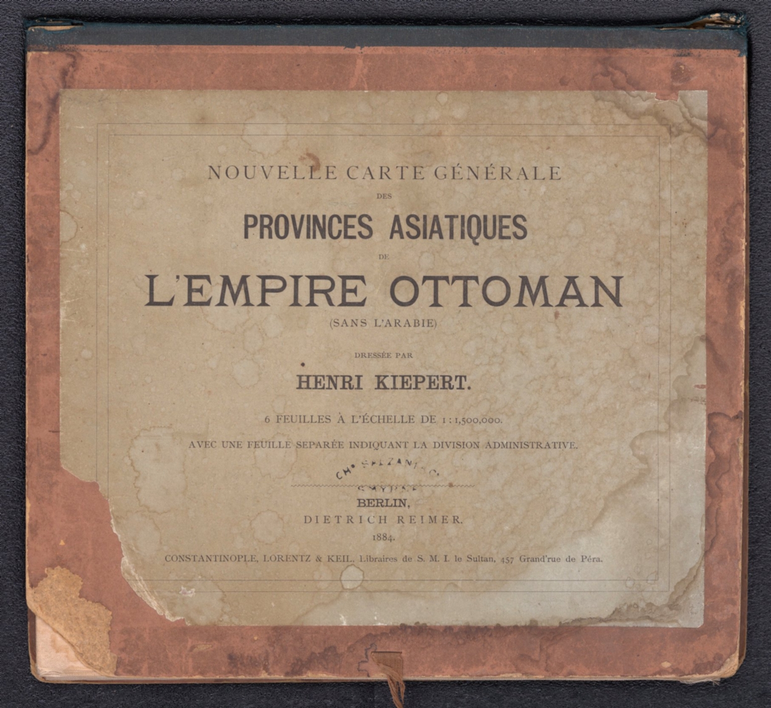
Map
Covers: Nouvelle carte generale des provinces asiatiques de L'empire Ottoman
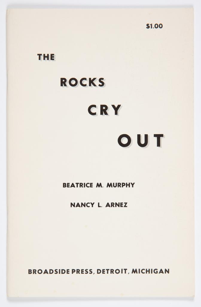
Print
The Rocks Cry Out

Print
Typography Printing - Colour Woodcut Recipe — #PredmetAutor:10328839
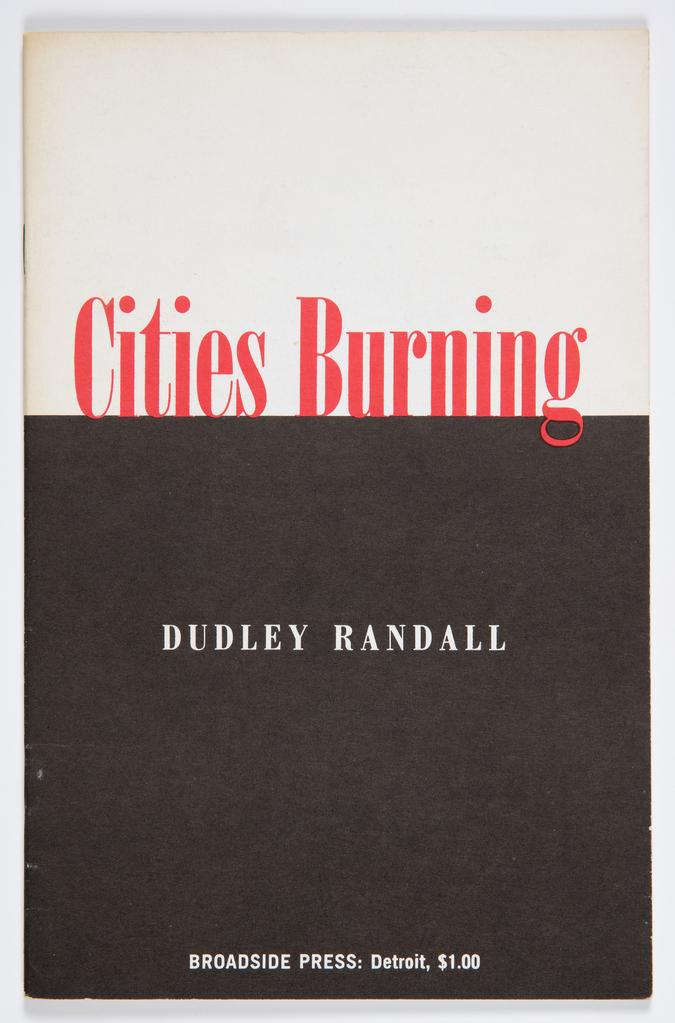
Print
Cities Burning
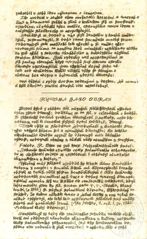
Print
Typography Printing - Colour Woodcut Recipe — #PredmetAutor:10328973
Thorowgood Grotesque Dimensional
Typeface
Thorowgood Grotesque Dimensional