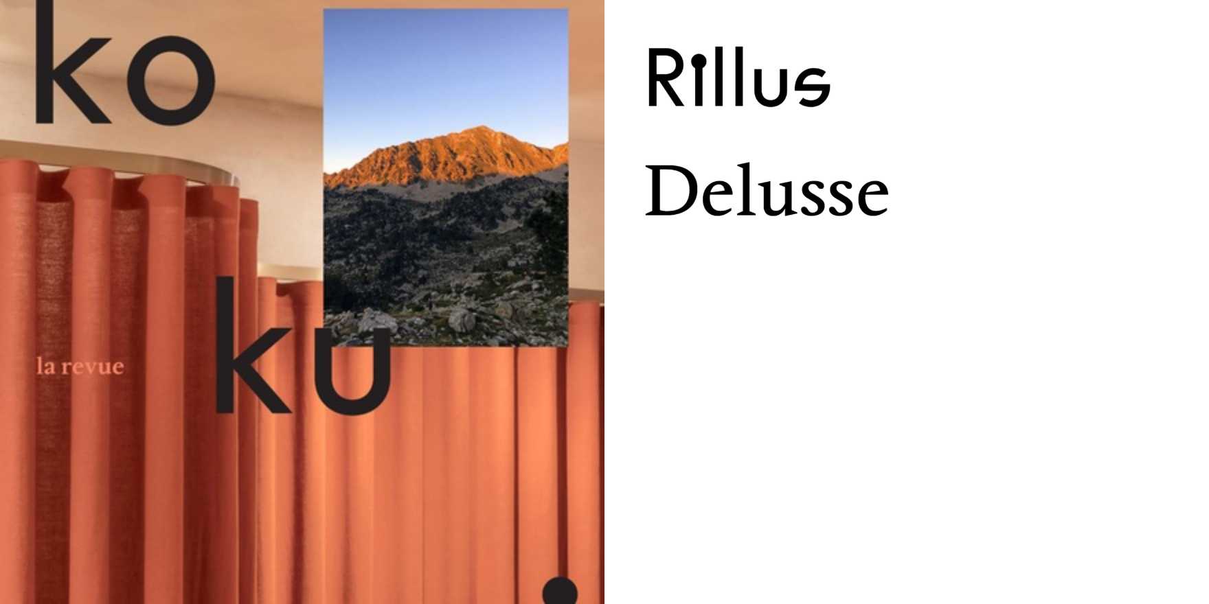
Kokumi –
Why It's In The Canon
The concept does the work before the type even loads: kokumi is the flavor quality that makes other flavors taste more like themselves — depth without a source, richness without fat. A publication built on that premise has already made a commitment about how type should behave. Study what happens to the hierarchy here. Nothing announces itself. The type holds its weight at reading scale the same way it holds it at display scale, which is genuinely rare — most editorial design collapses when you zoom out. The Japanese editorial tradition behind this is worth understanding structurally: tight grid discipline, restrained but precise leading decisions, a tolerance for silence in the layout that western editorial typically fills. The dash in the title is not decoration; it's the editorial voice in punctuation form — something left open, implying continuation without requiring it.
For someone building interfaces, branding systems, or content platforms now: this is a case study in how typographic restraint generates authority. The temptation in digital product work is to signal sophistication through variety — multiple weights, expressive cuts, tight CLS-optimized stacks. This shows the opposite route. One register, consistently held, accumulates trust across a reading session in a way that no amount of typographic flourish can fake. The specific lesson is pacing: how much air a publication is willing to hold around its text before it starts to feel like confidence rather than emptiness.


