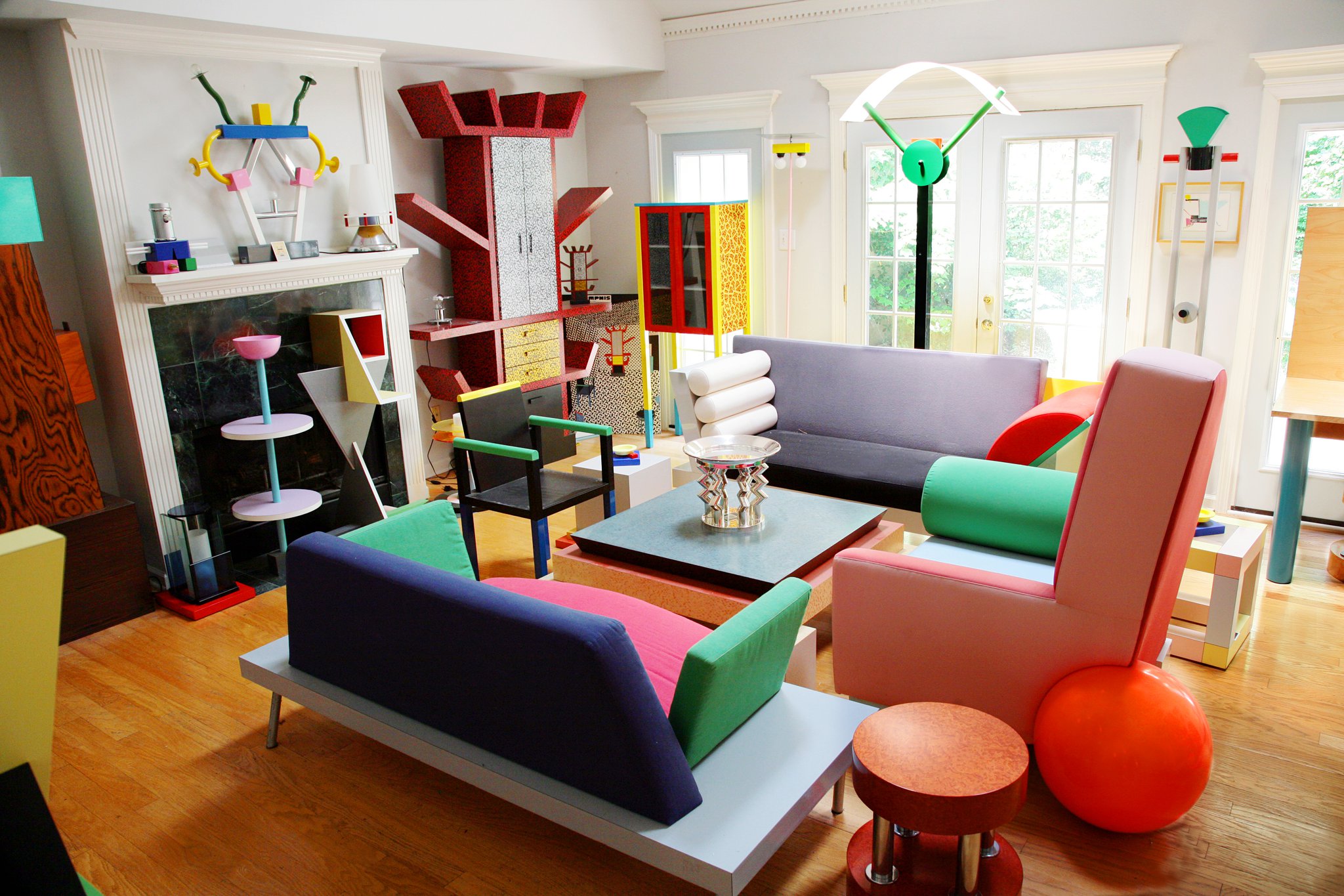
Memphis Group
The Movement
Sottsass and crew declared war on the Bauhaus dogma that an object should "speak its function." Memphis made furniture that spoke its mood instead — laminates in ugly patterns, chair legs in clashing colors, bookshelves that defied the idea of support. Deliberately anti-refined, priced aggressively high as a joke on bourgeois taste.
Core Tenets
- Function is a pretense; mood is the real content.
- Pattern is not decoration — it's argument.
- Clashing colors are more honest than harmonious ones because harmony is always trained.
- "Bad taste" is more interesting than good taste because good taste is consensus.
Aesthetic DNA
Laminate prints — squiggles, terrazzo, grids of dots, zigzags. Shocking pink next to teal next to ochre. Geometric primitives (cones, cylinders, grids) as structural elements, used ornamentally. Chairs and bookshelves that look like toys. Carlton bookcase (1981) is the signature piece.
Why It's In The Canon
2020s digital has quietly absorbed Memphis — Spotify Wrapped, Figma's brand, Duolingo motion, Gen-Z tech illustrations all carry the pattern-pattern-color-color logic. If you're tempted to call something "playful" in a brand deck, ask whether it's actually Memphis-descended. Study as the counterweight to any Swiss-tendency impulse.
Connected To
- Swiss International Style — the thesis Memphis was the antithesis of
- Vaporwave — late-digital grandchild


