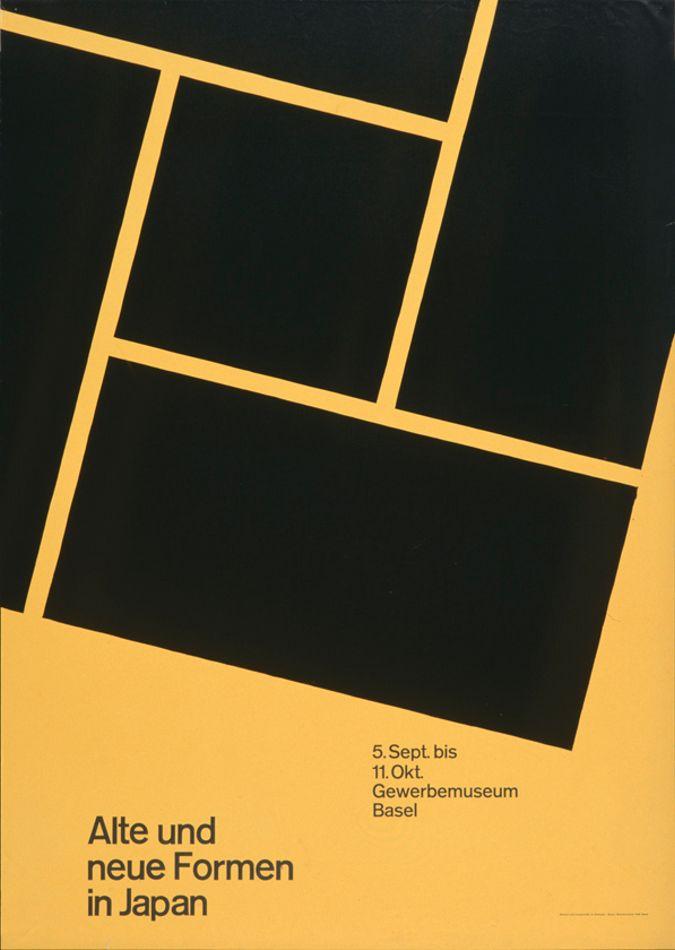
Swiss International Style
The Movement
The Swiss brought a design orthodoxy to post-war Europe: objectivity as a moral position. Grids, asymmetric layout, sans-serif (Helvetica 1957, Univers 1957), photography instead of illustration. Josef Müller-Brockmann, Emil Ruder, Armin Hofmann. The Swiss designer's job was not to express themselves — it was to disappear behind a system that anyone trained in it could reproduce.
Core Tenets
- Every decision must be defensible. Intuition is suspicious.
- The grid is not a constraint; it's an argument — that reading is the task, not looking.
- Photography is evidence. Illustration is editorial.
- Sans-serif is universal. Serif is specific.
- Type is set in mathematical proportions; leading, column widths, and sizes form a calculable system.
Aesthetic DNA
Black on white. Flush-left-ragged-right. 8pt modular grid. Asymmetric balance — a single photographic image pinned by a ranked text block. Univers or Helvetica set in 2–3 sizes across the whole piece. Ruthless whitespace. Red only as a warning.
Why It's In The Canon
Swiss is the root of every "clean systematic" digital design system today — shadcn/ui, Radix, Apple's visual language, Stripe's layout discipline all descend from Müller-Brockmann's grid logic. Any AI-first design project that takes tokens and systems seriously is operating downstream of Zurich 1955. If you're building tokens and components, you're being Swiss whether you know it or not — and that's worth knowing on purpose.
Successors
- Ulm HfG — post-Bauhaus curriculum that institutionalized Swiss rigor
- Basel Schule — Weingart's expressive mutation from inside the Swiss core
Connected To
- Otl Aicher — the movement's most complete identity practitioner


