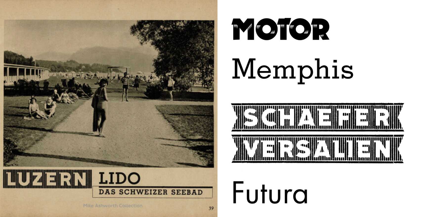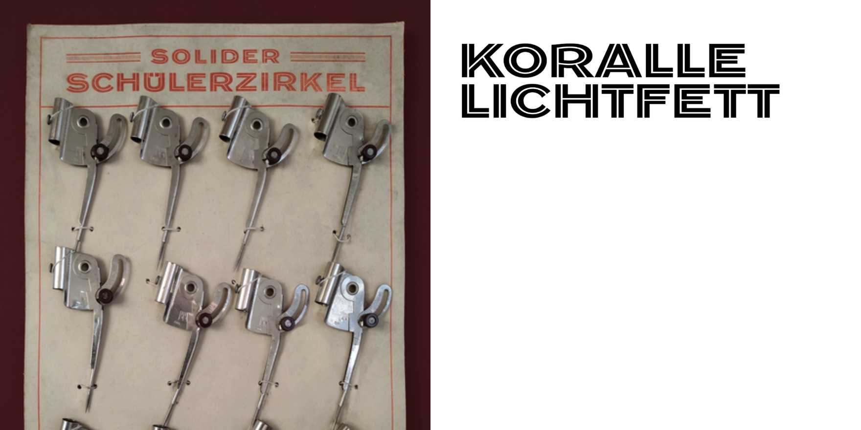
M.E.R. Gesellschaftsreisen tourist brochure
Why It's In The Canon
German mid-century commercial print did something digital design keeps failing to replicate: it made aspiration feel earned rather than sprayed. The M.E.R. Gesellschaftsreisen brochure is a study in what constrained production forces — limited color separations, a fixed type inventory, offset lithography with no room for accident — when those constraints are met with actual typographic intelligence rather than workarounds. The koralle-lichtfett treatment is the specific thing to examine: a display weight that sits between roman and bold, warm in color register, doing contrast work without the bluntness of full-fett. It holds emphasis against photographic backgrounds without needing a white knockout or a drop shadow. That's a solved problem that contemporary web designers keep re-solving badly.
The hierarchy in this class of brochure — headline, subhead, body, caption — operates as a grammatical system, not a mood board. Tourist brochures had brutal constraints: one rack, thirty seconds, a reader with no obligation to stop. The type had to sell a destination before the image did. That structural pressure is what makes this worth studying now. Anyone building landing pages, onboarding sequences, or brand systems is working the same problem: maximum aspiration, minimum friction, zero wasted real estate. The German commercial print tradition holds cleaner answers than most contemporary design references, and this brochure is an unusually legible specimen of why.