Redheads
Why It's In The Canon
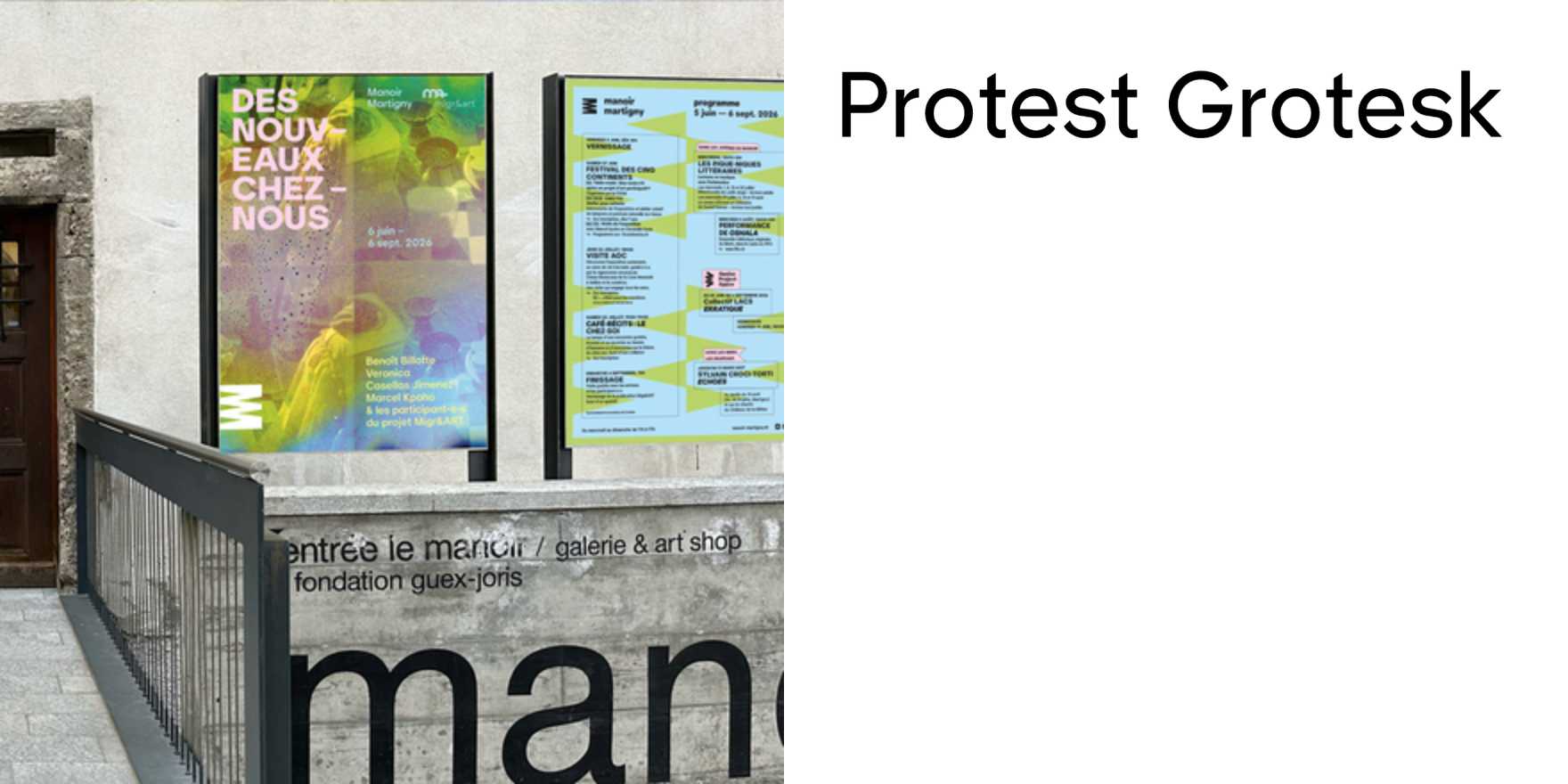
Protest Grotesk has a trap built into it: the name telegraphs its politics so loudly that most who reach for it end up making work that performs activism rather than uses a good typeface. Redheads shows what it looks like when that trap is avoided — when the type is doing structural work instead of symbolic work.
The specific things to study here are the weight distribution and how scale changes the typeface's character. Protest Grotesk's stems carry a slight irregularity that reads as rawness at display size and as authority at text size. This use navigates that range without losing coherence. The other thing worth noting is how the typeface's native personality — which in most contexts reads as editorial, slightly oppositional — translates into a product or brand register without being defanged. The friction becomes character rather than noise.
This matters now because the grotesque landscape is crowded with optically-correct, extremely smooth typefaces that are legible and inert. Protest Grotesk is an alternative that actually has something happening at the letterform level. For anyone working on visual identity in creative tooling, platforms, or branded interfaces — knowing when a typeface with this much texture is the right call, and seeing it deployed cleanly, is worth more than a specimen sheet. The use is the argument.


