Studio Freight
Why It's In The Canon
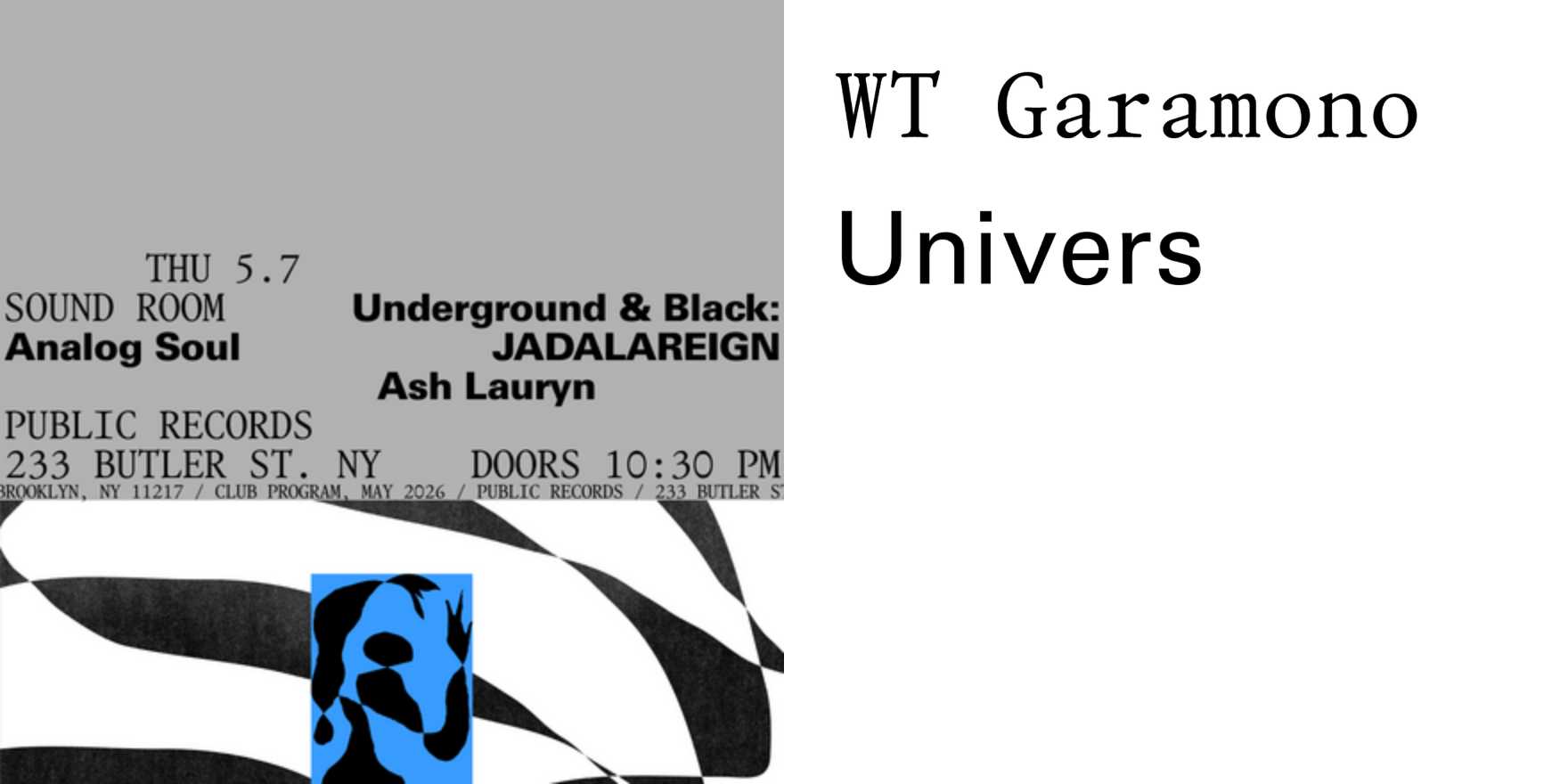
The lesson here is typographic precision surviving the web's worst tendencies. Studio Freight builds interactive work where Garamono and Univers don't function as stylistic choices — they carry the layout logic. The type establishes hierarchy before any motion, state change, or scroll interaction, which means the design holds when stripped of all the performance. That's a structural discipline worth studying: not decoration applied to interaction, but type as the load-bearing system underneath it.
Garamono specifically deserves close attention. It's a digital-native Garamond interpretation — warmer than the historical cuts, with spacing assumptions built for screen resolution rather than fighting it. The way Studio Freight deploys it across display sizes, long-form editorial, and constrained grid containers shows how a typeface performs under real pressure. Pairing it with Univers is a Continental modernist move, but their execution avoids the cold institutional register that pairing usually produces. The warmth holds. The Univers stays functional without going corporate.
For anyone building creative tooling, brand systems, or web platforms where typography has to survive context shifts, Studio Freight is a live case study in scale-without-slippage. The question their work answers: what does typographic intelligence look like when the substrate is code, motion, and state? Study their type choices first — the interaction is downstream of those decisions.


