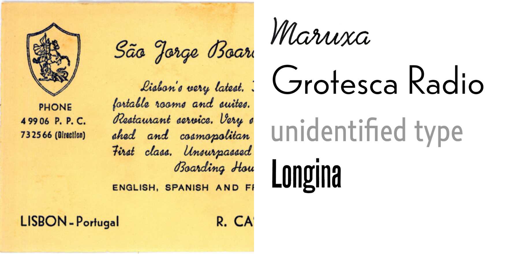
São Jorge Boarding-House
Why It's In The Canon
Portuguese vernacular signage is one of the most underlooted reference pools in European typography, and this boarding-house facade is a good reason why. The combination here — Maruxa, a type with unmistakably Iberian warmth in its stroke modulation, sitting alongside a Grotesca Radio variant and at least one typeface no one has formally named — tells you more about how lettering actually functioned in mid-century Portuguese commercial culture than any specimen book would. The unidentified face is the most instructive part: it means something was drawn, cut, or adapted locally and never entered the canon. That gap is data. It shows where standardized type distribution ended and where local craft filled in.
Longina shows up here as a grounding element — structurally confident, not decorative, the kind of face that makes a building look like it knows what it is. Study the hierarchy across the facade: what's set in what, how weight contrast does the work that color and scale can't always do in built environments. For anyone building visual systems for web platforms or branding today, this is the argument for studying type-in-use rather than type-in-isolation. Real signage had to survive distance, weathering, and competing visual noise. The choices that survived that selection pressure are worth understanding. The unidentified grotesque especially — someone made that call without a reference library.
Closest kin


