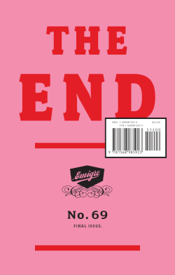
Emigre Magazine
The Object
A magazine that was also a type foundry that was also a running argument. Rudy VanderLans and Zuzana Licko started Emigre in 1984 on the first Macintosh. Licko designed bitmap typefaces native to the 72dpi screen and laser printer — the first faces designed FOR the digital medium rather than ported to it. Each issue showcased new typefaces by reading them, and the magazine's editorial register was provocation: "what is typography when the printing press is no longer the constraint?"
Editorial System
- Every issue had a different format, grid, and typographic palette — deliberately refusing a consistent "house style" because the house was the argument.
- Type specimens embedded in essays, not in catalog back-matter.
- Many issues interviewed or sparred with figures outside design (writers, philosophers, critics).
- Letters-to-the-editor pages often ran longer than articles.
Why It's In The Canon
Emigre is proof that a magazine can be a political-aesthetic project (pro-digital-native typography, anti-Modernist orthodoxy) and that magazines can seed movements. Every post-1990 discussion about digital type — system fonts, variable fonts, web fonts — runs through Emigre. Also a good reminder that a magazine with 500 subscribers can be more influential than one with 500,000 if the 500 are the right 500.
Connected To
- Swiss International Style — the thesis Emigre spent 20 years arguing against
- Basel Schule — Weingart's license-to-deviate was Emigre's permission slip
Closest kin


